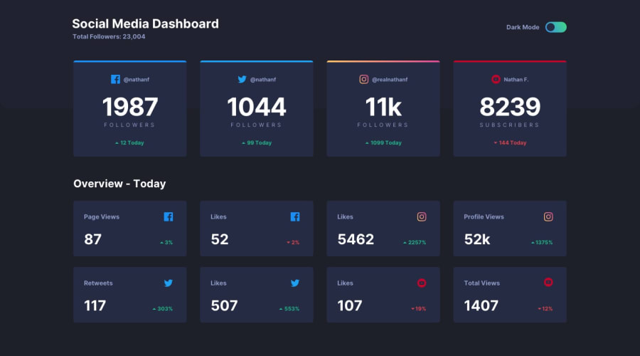
Design comparison
SolutionDesign
Solution retrospective
Feedback will be appreciated😊👍
Community feedback
- @tesla-ambassadorPosted over 2 years ago
Hey Harsh, This is a very awesome solution, it looks really sharp! The main thing to note is on the responsiveness, it kinda breaks on a screen width of 590px - 530px. You might want to reduce the number of grid columns on your grid components to 2 and then you can reduce them to "1" when you reach the threshold of 2 grid columns. This is bound to make it more responsive and smooth! Happy Coding! 💪
Marked as helpful1@hv443Posted over 2 years ago@tesla-ambassador TY for the compliment and the advice .. Will definitly apply it😊👍
1
Please log in to post a comment
Log in with GitHubJoin our Discord community
Join thousands of Frontend Mentor community members taking the challenges, sharing resources, helping each other, and chatting about all things front-end!
Join our Discord
