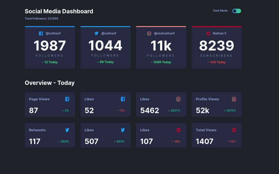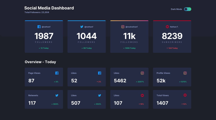
social-media-dashboard-with-theme-switcher-master
Design comparison
Community feedback
- @FlorianJourdePosted over 1 year ago
Hey Eduardo !
Nicely done, your dark theme is working well !
Be careful, your responsive solution has some glitches : when screen size is very small (under
350px), your layout begin to break. This is because of using fixedwidth&heighton your.primeiroan.boxelements. Of course, nobody have this size layout nowadays, but still, I think it's a good point to think "flexible" ! I would recommend you to avoid these fixed properties when you can, and just play around with paddings & margins.As well, it's a tiny detail, but I think it's a better practice to name CSS classes with English language. I struggled too, because of my native language, which is French, haha ! But when coming into big projects, you'll see it's easier to find your way if everything is written in English. I think this advice is valid for every code language you'll meet ✌️
Keep up the good job !
Marked as helpful0@Eduardo-Marque-sPosted over 1 year ago@FlorianJourde
Thank you for the tip ✌️
1
Please log in to post a comment
Log in with GitHubJoin our Discord community
Join thousands of Frontend Mentor community members taking the challenges, sharing resources, helping each other, and chatting about all things front-end!
Join our Discord
