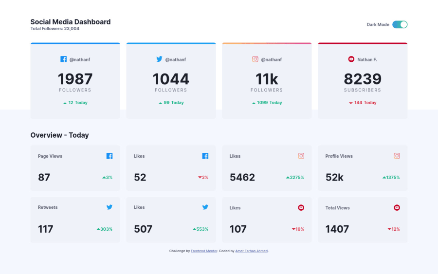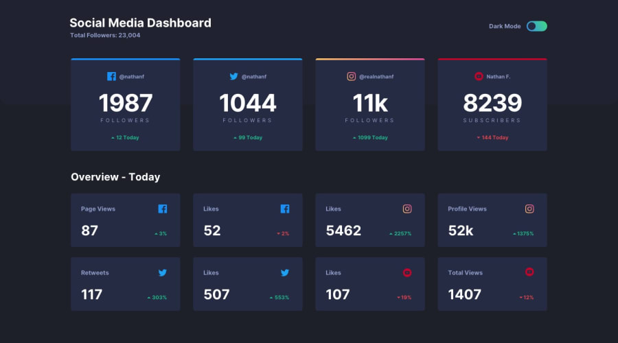
Design comparison
SolutionDesign
Solution retrospective
I used vanilla javascript with sass and grid system
Community feedback
- @Yemisrach15Posted about 2 years ago
Hi Amer, great job! This is how I approach dark/light theme switch too :) Here are a few suggestions of mine,
- The theme toggle button is not accessible to keyboard users and other assistive technology users. I can't focus on the button when I tab through your page. So you need to change it to, for instance, a checkbox input, link the input to a label, style the label to look like the design and hide the default checkbox input. Clicking on the label is like clicking on the checkbox.
- Wrap the section after the header with
maintag. - Avoid adding unnecessary elements in the HTML as in the
spanthe top horizontal bar on the cards. You can use pseudo elements as an alternative. - You should have only one
h1heading per page. It's what identifies the main title of your page so more than one title creates confusion. - The social media icons as well as the up and down icons should have an
alttext as they contribute to the meaning of the cards' content. - The overview-today section is part of the main content of the page so it should be inside
main. But you can put the.attributionin a footer element.
Keep up the great work
Marked as helpful0@Mrcode93Posted about 2 years ago@Yemisrach15 thank you for your suggestion its a helpful thing.
0
Please log in to post a comment
Log in with GitHubJoin our Discord community
Join thousands of Frontend Mentor community members taking the challenges, sharing resources, helping each other, and chatting about all things front-end!
Join our Discord
