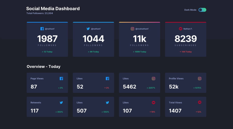
Design comparison
Solution retrospective
Any feedback and suggestions on how I can improve are very welcome!!
Community feedback
- @mattstuddertPosted over 4 years ago
Awesome work on this challenge, Clinton! You've done a really good job. If I was being really nitpicky I'd say you'd get a lot out of doing one more small round of refinements to really get it matching up to the design. The spacings are just slightly off and the Instagram card at the top doesn't have a gradient on it like in the design.
But like I said, that's if I'm being nitpicky 😅 You've done a really good job, keep it up!
0@ClintjeezPosted over 4 years ago@mattstuddert Alright thanks for your feedback I will fix them up asap, though I treid with gradient border it was acting differently so just had to go for the single color I will do more research on how to implement that and the spacing don't really get that though but will compare my solution with design again. And you not being nitpicky your feedback really means a lot to me thanks😇
0@mattstuddertPosted over 4 years ago@Clintjeez you're welcome! The gradient is possible, so I'd recommend giving it another go. A good way of learning would be to look at other people's solutions for this challenge to see how they've done it. This is great if you're stuck. There's also the Slack channel where you can ask for help 🙂
For the spacing, you can see in the comparison that the space between the top and the first row of cards and the gap between the two sections are both a little large.
Like I said though, you've done a really good job on this 👍
0
Please log in to post a comment
Log in with GitHubJoin our Discord community
Join thousands of Frontend Mentor community members taking the challenges, sharing resources, helping each other, and chatting about all things front-end!
Join our Discord
