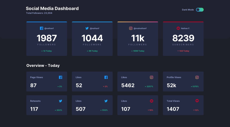
Design comparison
SolutionDesign
Solution retrospective
Hi, this is the first challenge that I've completed with React. It was a bit challenging to create the toggle between dark and light mode, but overall this challenge has been very interesting. If anyone has any suggestions, they are welcome. I don't know how to make the gradient of the toggle button change when switching to light mode.
Community feedback
- @0xabdulkhaliqPosted over 1 year ago
Hello there 👋. Congratulations on successfully completing the challenge! 🎉
- I have other recommendations regarding your code that I believe will be of great interest to you.
LABELS 🔖:
inputelements wants alabelassociated with it
- A
<label>is used to create a caption for a form control. The<label>can be associated with a form control either implicitly by placing the control element inside the label element, or explicitly by using the for attribute
- Effective form
labelsare required to make forms accessible. The purpose offormelements such ascheckboxes,radiobuttons,inputfields, etc, is often apparent to sighted users
- Even if the
formelement is not programmatically labeled. Screen readers users require useful formlabelsto identifyformfields.
- Example:
<label class="large-label" for="your-name">
  Your name
  <input id="your-name" name="your-name" type="text" />
</label>
.
I hope you find this helpful 😄 Above all, the solution you submitted is great !
Happy coding!
1
Please log in to post a comment
Log in with GitHubJoin our Discord community
Join thousands of Frontend Mentor community members taking the challenges, sharing resources, helping each other, and chatting about all things front-end!
Join our Discord
