Design comparison
SolutionDesign
Community feedback
- @alkarim99Posted almost 3 years ago
Good Job Emanuel👍
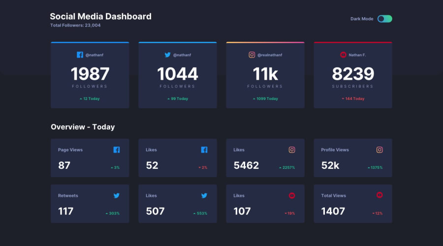
You put all the elements well. A little advice from me there are some elements that are not visible in light mode and dark mode, such as the up arrow and the down arrow.
Overall it's been very good, keep up the good work👏
Best regards, Abdullah
0
Please log in to post a comment
Log in with GitHubJoin our Discord community
Join thousands of Frontend Mentor community members taking the challenges, sharing resources, helping each other, and chatting about all things front-end!
Join our Discord
