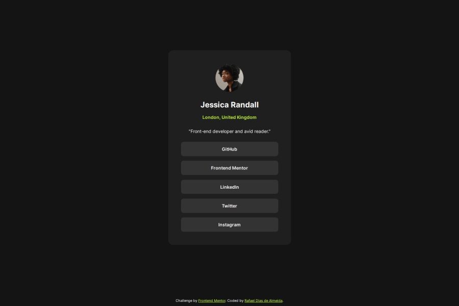
social-links-profile-main using flexbox and grid
Design comparison
Solution retrospective
I'm proud by create the layout using the correct HTML semantic. Tag is used in actions, while tag is used to link pages.
What challenges did you encounter, and how did you overcome them?I didn't have problems.
What specific areas of your project would you like help with?I would like to help in the use of correct HTML semantic.
Community feedback
- @amdadul-haquePosted about 1 year ago
I think using
transitionwill create a nice visual when hovering over the links. You can use it in theatag like thisa[href="#"] { //other styles transition: background-color 0.5s; }Marked as helpful1P@rafaeldgeoPosted about 1 year agoHi @amdadul-haque Thank you for suggestion!!! I think will be very cool
0 - @dan9hPosted about 1 year ago
Hey there! Your solution looks great. I just have a few suggestions.
Try to use
<ul>or<menu>tag for the social links.Example:
<ul>
  <li>
    <a href="#">Link 1</a>
  </li>
  <li>
    <a href="#">Link 2</a>
  </li>
  <li>
    <a href="#">and so on</a>
  </li>
</ul>
Also, add some class or id selectors to your HTML tags, so you can target and style specific elements with CSS.
Hope you'll find this helpful.
Marked as helpful1P@rafaeldgeoPosted about 1 year agoHi @dan9h
I appreciate your suggestion! I will change now!
Thanks so much
0
Please log in to post a comment
Log in with GitHubJoin our Discord community
Join thousands of Frontend Mentor community members taking the challenges, sharing resources, helping each other, and chatting about all things front-end!
Join our Discord
