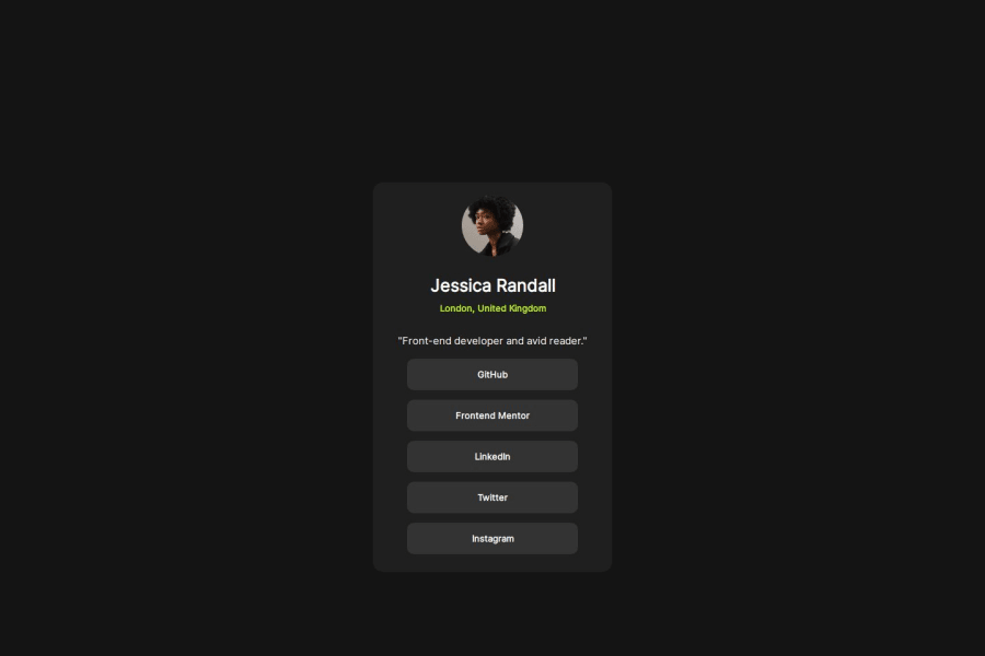
Design comparison
SolutionDesign
Community feedback
- @BlackpachamamePosted 10 months ago
Greetings! you have done a great job 😎
📌 Some suggestions
- Why do you use
min-height: 115vhfor desktop? that generates a vertical scroll - In this case, they should not be
buttonbutasince they are links to other pages
Marked as helpful0 - Why do you use
- @YousefZamanpourPosted 10 months ago
Hi celina o/ Suggestion-1: it's always a good idea to use rem unit instead of pixel for font-sizes, and every 1rem is equal to 16px, so in the style guide provided to you it's mentioned to use 13px for font-size, so 13 / 16 = .8125 rem. Suggestion-2: usually when you have fixed width and height on your elements you eventually run into problem. in your css .social-links-container you have set width of 350px which is a good size, but instead use max-width. and remove the height in total or set it to min-height. overall great work
Marked as helpful0
Please log in to post a comment
Log in with GitHubJoin our Discord community
Join thousands of Frontend Mentor community members taking the challenges, sharing resources, helping each other, and chatting about all things front-end!
Join our Discord
