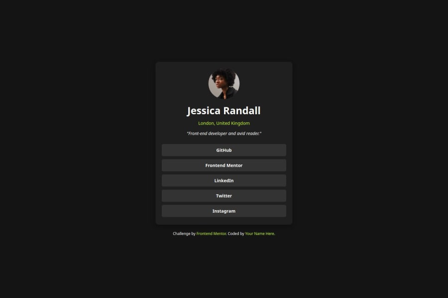
Design comparison
Solution retrospective
I am happy and proud of how I was able to use HTML and CSS to achieve this. I am going to try and us great to do this same thing
What challenges did you encounter, and how did you overcome them?Ensuring that the layout adapts well across various screen sizes (from mobile to desktop). The design might look great on 375px and 1440px screens, but intermediate screen sizes (e.g., tablets) can introduce layout issues if not tested thoroughly.
Different browsers may interpret CSS styles slightly differently. A button might look perfectly styled in Chrome but appear broken in Firefox or Safari.
What specific areas of your project would you like help with?the ard is something i would love to adjust to fit the exact image
Community feedback
- @AdrianoEscarabotePosted about 1 month ago
Hi Gilbert Ofori-Boye, how’s everything? I think your project turned out great! However, I have some feedback that I think might be useful:
To enhance the semantics of your code, consider using a
<ul>(unordered list) for the collection of links, as it represents a list of related items. Here's an example:<ul> <li><a href="#">GitHub</a></li> <li><a href="#">Frontend Mentor</a></li> <li><a href="#">LinkedIn</a></li> <li><a href="#">Twitter</a></li> <li><a href="#">Instagram</a></li> </ul>Using a
<ul>provides clear structure and context, signaling to both browsers and assistive technologies that these links are part of a cohesive group, improving both accessibility and readability.The rest is amazing.
I hope this is helpful. 👍
0
Please log in to post a comment
Log in with GitHubJoin our Discord community
Join thousands of Frontend Mentor community members taking the challenges, sharing resources, helping each other, and chatting about all things front-end!
Join our Discord
