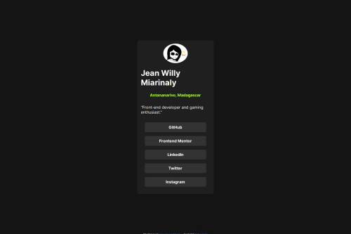
Design comparison
SolutionDesign
Solution retrospective
What are you most proud of, and what would you do differently next time?
Proud for having finished this project without too much struggle
What challenges did you encounter, and how did you overcome them?Didn't encounter any hard challenges. Just proud that everything I've learn so far are being used and not forgotten
What specific areas of your project would you like help with?I would like to have opinion about the html sematics if it is correct. And also I would like to know if there is a specific way to structure the css file code to make a better code
Community feedback
- @0xabdulkhaliqPosted 7 months ago
Hello there 👋. Congratulations on successfully completing the challenge! 🎉
- I have a suggestion regarding your code that I believe will be of great interest to you.
BODY MEASUREMENTS 📐:
- Use
min-height: 100vh
forbody
instead ofheight: 100vh
. Setting theheight: 100vh
may result in the component being cut off on smaller screens, such as mobile devices in landscape orientation
- For example; if we set
height: 100vh
then thebody
will have100vh
height no matter what. Even if the content spans more than100vh
of viewport.
- But if we set
min-height: 100vh
then thebody
will start at100vh
, if the content pushes thebody
beyond100vh
it will continue growing. However if you have content that takes less than100vh
it will still take100vh
in space.
.
I hope you find this helpful 😄 Above all, the solution you submitted is great !
Happy coding!
Marked as helpful0 - @sivaprasath2004Posted 7 months ago
Hello I`m wishing for your completion project.
- I will see in your project solution
preview site
. - I
m appreciate your
innovative` solution.I will some suggestion it is used for your solution. - In your CSS Code to change the following code to make proper solution format
.container { background-color: hsl(0, 0%, 12%); display: flex; justify-content: center; flex-direction: column; border-radius: 10px; margin: auto; padding: 1%; font-family: "Inter"; width: 20%; }
- to change
.container { background-color: hsl(0, 0%, 12%); display: flex; justify-content: center; flex-direction: column; border-radius: 10px; margin: auto; padding: 1rem; font-family: "Inter"; width: auto; }
Marked as helpful0 - I will see in your project solution
Please log in to post a comment
Log in with GitHubJoin our Discord community
Join thousands of Frontend Mentor community members taking the challenges, sharing resources, helping each other, and chatting about all things front-end!
Join our Discord