Design comparison
SolutionDesign
Community feedback
- @IvanBerkutPosted 11 months ago
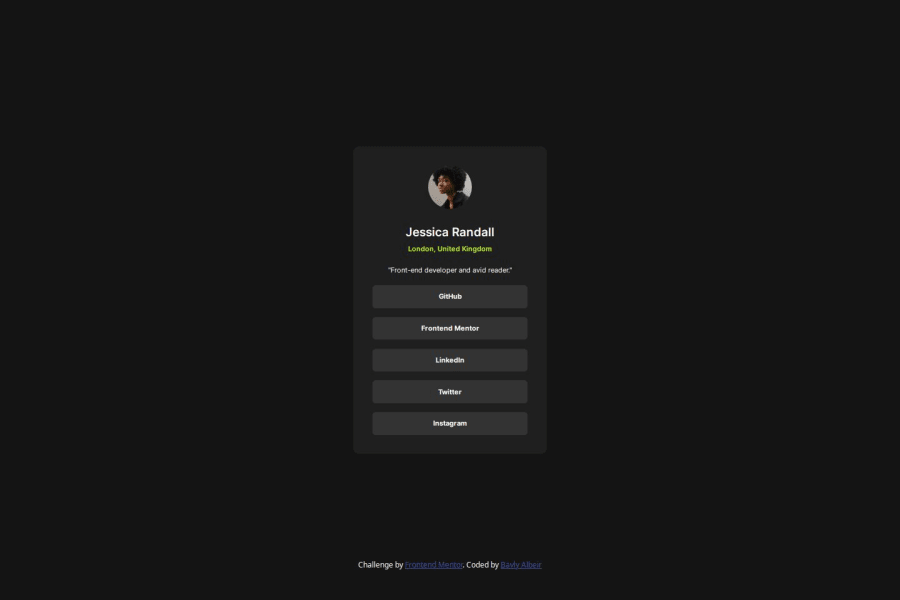
Nice implementation. I would also pay attention to the fonts. Also on the size of the elements. And I would add "cursor: pointer" for links, as it was in the layout.
0
Please log in to post a comment
Log in with GitHubJoin our Discord community
Join thousands of Frontend Mentor community members taking the challenges, sharing resources, helping each other, and chatting about all things front-end!
Join our Discord
