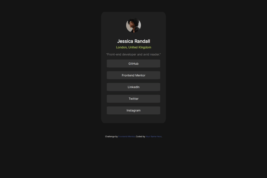
Design comparison
SolutionDesign
Solution retrospective
What are you most proud of, and what would you do differently next time?
This was a bit difficult with out Figma. Trying to guess the distance between each object is hard
What challenges did you encounter, and how did you overcome them?Styling the buttons in the card. The font size is a bit off. I was able to get the width and the padding down.
What specific areas of your project would you like help with?references to frontend stylings.
Community feedback
- @omlan99Posted 12 months ago
Your code looks good. You have done an excellent work without style reference.
0
Please log in to post a comment
Log in with GitHubJoin our Discord community
Join thousands of Frontend Mentor community members taking the challenges, sharing resources, helping each other, and chatting about all things front-end!
Join our Discord
