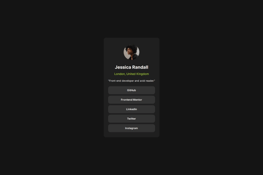
Design comparison
Solution retrospective
I used tailwind for the first time. Was fun. I'm looking forward to the next project :)
Community feedback
- @grace-snowPosted 9 months ago
Hi
You don't need to use any extension. Here are some important bits of feedback...
- Please be sure to Indent the code consistently so it's easier to read and spot bugs. Your code editor can even do this formatting automatically for you with prettier.
- This is a list of links. So you should be using a list element. Make sure you carefully consider the appropriate html elements for the content in each design. It's a really important skill to develop.
- It is better for performance to link fonts in the html head.
- The image is meaningful content so should have alt text. Read the excellent post in the resources channel on discord about how to write good alt text for an example.
- Node modules must never be pushed up to github!! It should be in the git ignore. Delete it. Packages are built at the point of deployment.
- Never limit the height of elements that contain text, including the body. Min height is fine. Height is definitely not.
- I would expect the image in this to have an explicit width and height.
Marked as helpful1 - @danielmrz-devPosted 9 months ago
Hello there! šš½āāļø
Your solution looks excellent!
I have a suggestion about your code that might interest you:
š If you don't have the Figma design files, I recommend using a browser extension called Perfect Pixel.
It allows you to compare your finished project with the design images that come along when you download the project and check the (almost exact) dimensions. It's very useful!
I hope it helps you in future projects! š
Other than that, great job!
1
Please log in to post a comment
Log in with GitHubJoin our Discord community
Join thousands of Frontend Mentor community members taking the challenges, sharing resources, helping each other, and chatting about all things front-end!
Join our Discord