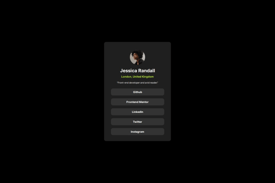


Design comparison
SolutionDesign

Solution retrospective
What are you most proud of, and what would you do differently next time?
I feel more comfortable seeing the designs and knowing how I can fix them.
What challenges did you encounter, and how did you overcome them?I had a small problem when making the list of social links, I completely forgot the "a" tags, I must reinforce HTML semantics.
What specific areas of your project would you like help with?i would like someone to help me to know how i can make my projects more responsive, if you play with the size of the screen you will notice that it has a static width, and if you make it smaller than that size you lose the project. so if you could tell me how to make the sizes of the cards adapt to the size of the screens, i know that i should use media query.
Community feedback
Please log in to post a comment
Log in with GitHub
Join our Discord community
Join thousands of Frontend Mentor community members taking the challenges, sharing resources, helping each other, and chatting about all things front-end!
Join our Discord