Design comparison
Solution retrospective
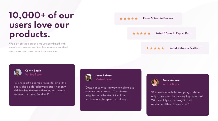
For this challenge, I found the mobile design to be a lot easier than the desktop design. Had a harder time figuring out how to layout the desktop and ended up utilizing grid layout. On the bright side, my understanding of grid layout is getting better and better!
Likewise with the previous challenges, I had a hard time figuring out the best background-size and background-position for the background patterns for desktop.
I did have an issue but wasn't sure if anyone else came across this. When I was trying to offset the bottom 3 user review cards, I could not get the height to stay while I updated their vertical margins. I expected the cards to move relative to the margin values, but ended up "squishing" itself and won't move past a certain point...if that makes sense.
Did not have time to review why it's producing that behavior tonight, but will take another look. If you guys know anything, please comment! If you have any feedback on the challenge, I'd highly appreciate it as well.
Thank you!
#happycoding
Community feedback
- @YazdunPosted about 3 years ago
I like the way you set background images, I used svgs in the markup and then gave position absolute to them in css, but yours looks much cleaner
0
Please log in to post a comment
Log in with GitHubJoin our Discord community
Join thousands of Frontend Mentor community members taking the challenges, sharing resources, helping each other, and chatting about all things front-end!
Join our Discord
