

Design comparison
SolutionDesign

Solution retrospective
What are you most proud of, and what would you do differently next time?
Having a good idea of what to do with ease and positioning each Review .
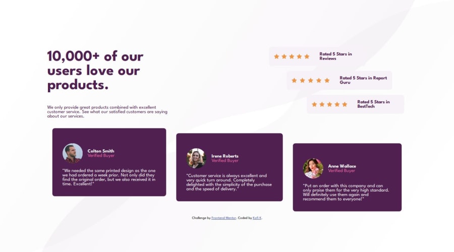
What challenges did you encounter, and how did you overcome them?A major challenge was positioning the review elements both from companies and customers to have a stair-like appearance in the webpage and with patience,I was able to position them with margin and width.
/*code here is used to set up the ratings of each Company*/

.card1__divRight__RatingMain{
    background-color:var(--LightGrayishMagenta);
    padding: 1rem;
    margin: .5rem;
    display: flex;
        justify-content: space-evenly;
        align-items:center;


       /* width: 100%;

### What specific areas of your project would you like help with?
Don't think I have much issues except some weird positioning with the Customer Reviews when the webpage is viewed from tablet devices and below.
Any suggestion and tips would be useful.
Thank you🙏
Community feedback
Please log in to post a comment
Log in with GitHubJoin our Discord community
Join thousands of Frontend Mentor community members taking the challenges, sharing resources, helping each other, and chatting about all things front-end!
Join our Discord