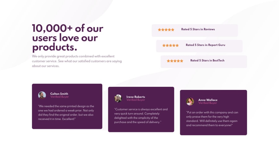
Design comparison
Solution retrospective
Parts that i think could be improved:
- How the stars are printed in the reviews at the top of the page, i used a repeating background image to avoid duplicating html img tags, is there another better solution here?
- Testimonials, when i removed the height attribute, the purple background filled to the bottom of the parent ul element removing the indentation, is there a better solution than hardcoding height?
Thank you for your feedback and help!
Community feedback
- @stfnpczkPosted about 3 years ago
Hello HutHut,
using
background-repeat: repeat-xis certainly a very good and efficient way to display the stars. Although there's nothing wrong with using multiple svgs here. As you put the stars in a flex container, you have more control over the gaps between them. But either way is fine, I think.As far as the indentation goes, I also struggled with that one. Instead of an explicit height, I used the
n-th childselector in combination withalign-selfand flex-start/ center / end. Have a look here if you like.Happy coding!
Marked as helpful0@j-hutchisonPosted about 3 years ago@stfnpczk Thank you for the feedback Stefan - really appreciated! 🦾
0
Please log in to post a comment
Log in with GitHubJoin our Discord community
Join thousands of Frontend Mentor community members taking the challenges, sharing resources, helping each other, and chatting about all things front-end!
Join our Discord
