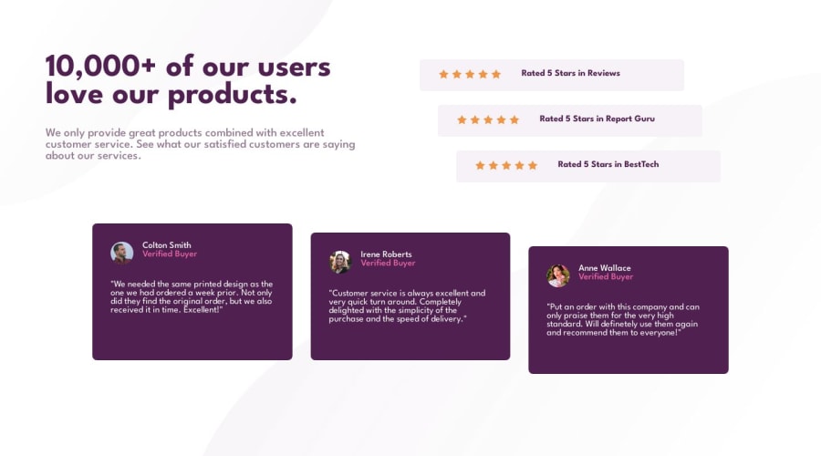
Design comparison
SolutionDesign
Solution retrospective
What are you most proud of, and what would you do differently next time?
Happy with my general understanding of layouts. Still get slowed down considering when to use what, looking forward to understanding how and when to use one over the other automatically.
What challenges did you encounter, and how did you overcome them?I got stuck with trying to get the background image to the appropriate spot. First I changed 'absolute' to 'static', then applied a z-index to not have it be on top of the other elements.
What specific areas of your project would you like help with?Any feedback is welcome.
Community feedback
Please log in to post a comment
Log in with GitHubJoin our Discord community
Join thousands of Frontend Mentor community members taking the challenges, sharing resources, helping each other, and chatting about all things front-end!
Join our Discord
