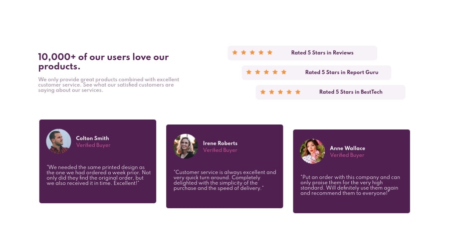
Social proof section w/ custom css, responsive, normalize.css


Design comparison

Solution retrospective
Hello! This is my solution for this simple challenge. I try to make it responsive for most common resolutions, following a guide from Bartholomej (acknowledgment is in readme). Tell me if I'm doing the right approach + any feedback is welcome.
Community feedback
- @sweenejpPosted over 3 years ago
Hi Nicolas,
Looks like you need to adjust your media queries. Typically you don't want any side scrolling. The layout breaks at around 1300px. Personally I think it's better to set media queries based on when your layout breaks - not based on typical sizes of screens.
You probably just need one media query here if you take a mobile first approach. Create the mobile layout, then set a
min-widthmedia query for when you want to transition to the desktop layout (somewhere around 1300px probably). Then make the necessary layout adjustments under that media query (flex-direction: row;, etc, etc).Marked as helpful0

Please log in to post a comment
Log in with GitHub
Join our Discord community
Join thousands of Frontend Mentor community members taking the challenges, sharing resources, helping each other, and chatting about all things front-end!
Join our Discord