Design comparison
SolutionDesign
Solution retrospective
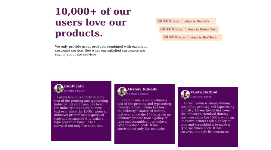
I tried this for practice................
Community feedback
- @vishalpankhadePosted 10 months ago
you should have added border-radius: 12px on user details boxes, so the edges would look rounded and nice
0
Please log in to post a comment
Log in with GitHubJoin our Discord community
Join thousands of Frontend Mentor community members taking the challenges, sharing resources, helping each other, and chatting about all things front-end!
Join our Discord
