Submitted about 1 year ago
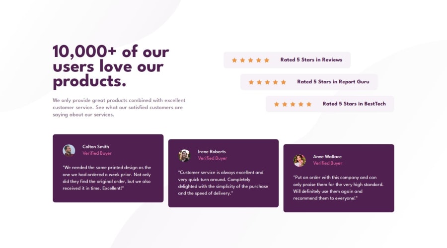
Social proof section using Sass
#bem#sass/scss

@Jorge-sanchez09

Design comparison
SolutionDesign

Solution retrospective
- First project using Sass after a few weeks learning it. I'm not sure if I made a good use of nesting and mixins
- I wanted the testimonials container to be fully responsive so it can have 1-3 columns, so I applied a little bit of JavaScript in order to transform the testimonials Y coordinates only when the grid has 3 columns
Anything that could help improve my scss or any code in general will be apreciated
Community feedback
Please log in to post a comment
Log in with GitHub
Join our Discord community
Join thousands of Frontend Mentor community members taking the challenges, sharing resources, helping each other, and chatting about all things front-end!
Join our Discord