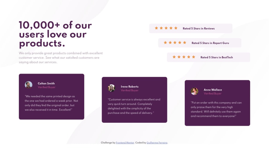
Social Proof Section using HTML5 and CSS3 Flex Box
Design comparison
Solution retrospective
Hello community! This is my fourth challenge and it was really challenging. This was my first time using FLEX BOX in a project since I've learned that in the WebDev class but I'm happy with the final result. I know that there's a lot to work on and to improve in my code. So, all feedback is welcome. Thanks!
Community feedback
- @ApplePieGiraffePosted over 3 years ago
Hey, Guilherme Ferreira! 👋
Nice work on this challenge! 🙌 Your solution looks good and is responsive and it's good to know you learned some new things will completing this challenge! 😀
The only tiny suggestion I have is to leave the
alttext for the star icons as an empty string, since they are mostly decorative images and don't need to be read out loud by screen readers (which is unnecessary and potentially a little annoying). 😉I hope that's a little helpful and that you enjoy completing more challenges! 👍
Keep coding (and happy coding, too)! 😁
Marked as helpful1@guilhermereraPosted over 3 years ago@ApplePieGiraffe Accessibility is something I need to work on and pay more attention to in furure projects. 15 " STAR ICON " voice reading would, for sure, be annoing hahaha Thanks for the suggestion and overall feed back! 😁
1@ApplePieGiraffePosted over 3 years ago@guilhermerera
Awesome! Glad to help! 😀
0
Please log in to post a comment
Log in with GitHubJoin our Discord community
Join thousands of Frontend Mentor community members taking the challenges, sharing resources, helping each other, and chatting about all things front-end!
Join our Discord
