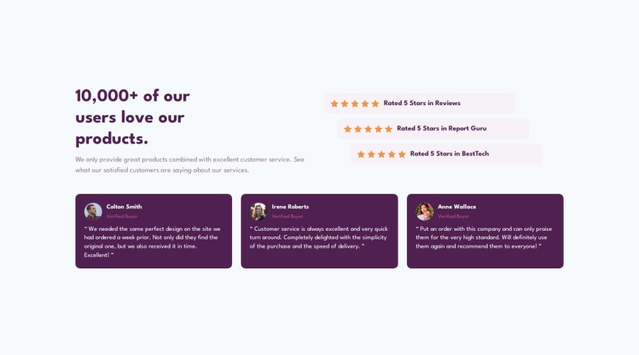


Design comparison

Solution retrospective
I am most proud that I successfully completed this challenge using only HTML and CSS. It helped me improve my understanding of structuring a webpage and styling it to match the given design. Next time, I would focus on making my code more efficient by using CSS flexbox/grid more effectively and ensuring better responsiveness for different screen sizes.
What challenges did you encounter, and how did you overcome them?One of the challenges I faced was aligning the elements perfectly according to the design. Initially, some sections were not positioned correctly, but I resolved this by carefully adjusting margins, paddings, and using flexbox. Another challenge was ensuring that the text and images were responsive. I overcame this by using relative units like percentages and rem instead of fixed pixel values.
What specific areas of your project would you like help with?I need help with ensuring the print layout matches the reference exactly. There are minor alignment and spacing inconsistencies that need fixing. I want to improve the responsiveness so it adapts well to different devices. The typography and colors should be perfectly matched to the design. I’d like to optimize the HTML & CSS structure for better readability. Also, I need help debugging any unexpected display issues in print mode.
Community feedback
Please log in to post a comment
Log in with GitHub
Join our Discord community
Join thousands of Frontend Mentor community members taking the challenges, sharing resources, helping each other, and chatting about all things front-end!
Join our Discord