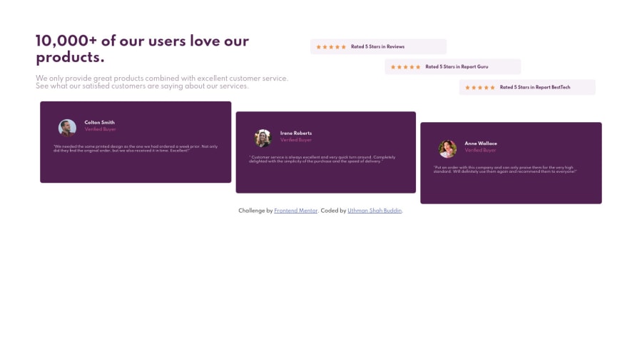
Design comparison
SolutionDesign
Solution retrospective
Do tell me if how I wrote the html and css okay (I'm really sorry if my code/end-product annoys/messy), and if not how can I improve. I still getting used to webdev terminologies. But I can search it real quick and learn it.
Community feedback
- @ApplePieGiraffePosted about 4 years ago
Hey, Uthman! 👋
Good job! 👍
I suggest,
- Setting a
max-widthon the testimonial boxes (and on the main container or wrapper) to ensure that they do not grow too wide on large screens. - Adding some
margin-bottomto the second review box with SVG stars. - Switching to a mobile-friendly layout sooner than 375px so that the page doesn't look too squished before the layout changes.
Keep coding (and happy coding, too)! 😁
0 - Setting a
Please log in to post a comment
Log in with GitHubJoin our Discord community
Join thousands of Frontend Mentor community members taking the challenges, sharing resources, helping each other, and chatting about all things front-end!
Join our Discord
