Design comparison
Community feedback
- @dylanguaquierPosted 6 months ago
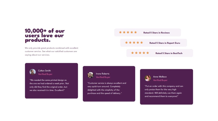
Be care, on your @media you put padding (with VW also, that's not a good idea).
So, in desktop mode, your text is no more align to your cards.
(i am using ultra wide screen, that's probably why but that not a good solution to put VW) so it scale with my screen badly
Marked as helpful1@YacoubDweikPosted 6 months ago@dylanguaquier
Thank you so much for your feedback!
It's working perfectly fine up to 2000px width and I guess you're using some kind of very wide screens like those which are used for gaming or even wider, I could have done more media queries to make it look good on those screens as well but you know for now I just use one breaker which is 825px, I needed to make the padding in vw cuz the design gets really messy if I used fixed units like pixels so I wanted to have the same layout but getting smaller paddings instead, I did not want to change the design layout itself, otherwise I would just activate the media query for the mobile design which is gonna have lots of white space at that screen size and this is not cool, we both know in real projects it does not work like this cuz they have three layouts like one for small screens, one for tablets and the last one would be for desktops and they sometimes add another one for very wide screens like yours.
I really appreciate your lovely feedback man thank you!
1
Please log in to post a comment
Log in with GitHubJoin our Discord community
Join thousands of Frontend Mentor community members taking the challenges, sharing resources, helping each other, and chatting about all things front-end!
Join our Discord
