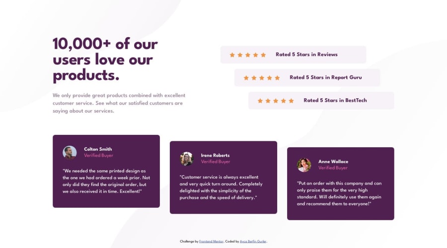
Design comparison
Solution retrospective
This was my first time aligning in a project like this. It was a little hard at first but I managed at the end! I hope you like the project and I would appreciate any feedback!
Community feedback
- P@danielmrz-devPosted over 1 year ago
Hello @aybegu!
Great job! The desktop version of this project is tricky 😅
I've been keeping track of your projects and noticed that you're still not using the mobile first approach on some of them, even though you do an excelent job creating the desktop versions (They are usually harder, like this one).
In fact, I don't know if you are familiar with the approach or not, but I'll share a bit of my experience:
-
If I start the project by its desktop version, I usually take much more time to build it's mobile version. The other way around does not happen. It seems easier to me to build the desktop version once the mobile one is finished. Actually, most times I just have to adapt the layout for bigger screens and do minor changes.
-
I don't know what is your goal with the challenges, but once you get used to this approach, I ensure you that things become easier.
It's just a piece of advice that (I hope) might help you on your journey. 😁
Cheers,
Daniel
1@aybeguPosted over 1 year ago@danielmrz-dev Thank you Daniel! I always forget the mobile version 😄 there is just one more project I am doing now, after that I will look for the mobile first approach.
1 -
Please log in to post a comment
Log in with GitHubJoin our Discord community
Join thousands of Frontend Mentor community members taking the challenges, sharing resources, helping each other, and chatting about all things front-end!
Join our Discord
