Design comparison
SolutionDesign
Solution retrospective
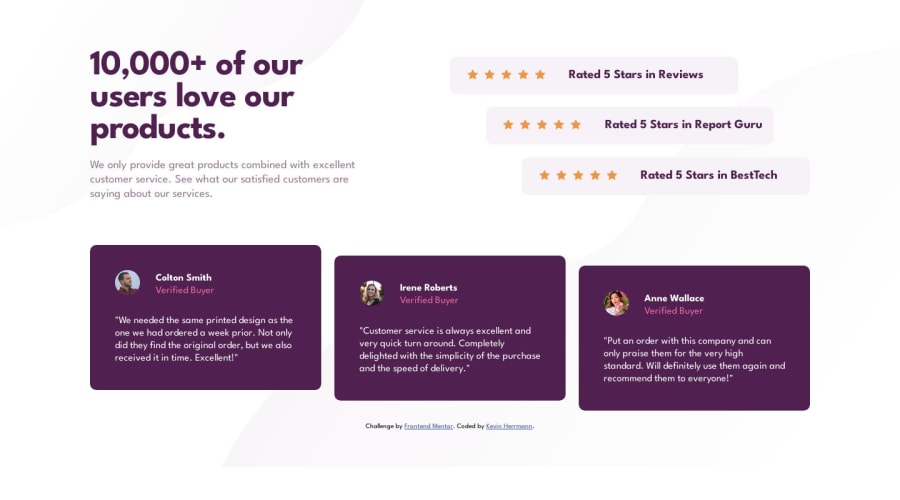
- Had some struggle finding the balance between when it's best to use Grid or Flexbox, so any feedback on my balance of that is welcome.
- Had more trouble than I expected working with background image positioning, getting the decorative images to line up correctly, or fill the whole space on different screen sizes without ending prematurely.
- Started with a mobile-first workflow, then adapted for desktop; any feedback on how I coded the media breakpoint, or anything I could have done more efficiently between the two designs, is welcome.
Community feedback
Please log in to post a comment
Log in with GitHubJoin our Discord community
Join thousands of Frontend Mentor community members taking the challenges, sharing resources, helping each other, and chatting about all things front-end!
Join our Discord
