Design comparison
Solution retrospective
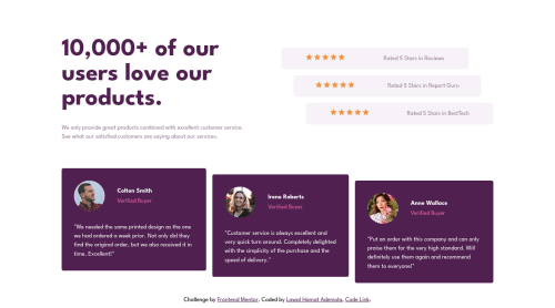
Hello Everyone, All feedback/review/correction/suggestions are welcome.
I've finished this project since few days back but I just keep looking for errors to correct and that make makes me loop through an infinite loop of correction. But I guess it can't be perfect.
here are my question:
- I used the markup below but I'm seeing some weird black border under/over my pink border, it kinda look like a default border, but I was expecting it to be overwritten by my style below, but it's not. kindly help to check what the problem is, this is my first time using :focus-visible.
a:focus-visible {
border: dotted 0.3rem var(--Soft-Pink);
padding: 0.3rem;
}
-
I used positive and negative border to make the boxes slightly away from each other, is there a better way ?
-
does the markup below work that much for SEO ? and what other
<meta>
would you recommend ?
<meta name="description" content="This is Engineer Hamziey's solution to FrontendMentor challenge(social proof section master)">
<meta name="Keywords" content="Web developer,Engineer Hamziey, Frontend developer">
- For the media query I used
@media (min-width: 1024px)
for the desktop, the design doesn't look satisfactory on screens lesser than 1024px in my opinion, any comment on that? what's your opinion?
Community feedback
- @Pawel-GnatPosted over 2 years ago
Hi mate. I've checked your code and my only advice is - try to code with a repeatable method.
Let me give you an example.
Your code:
.rating { display: flex; flex-direction: column; justify-content: center; align-items: center; width: 100%; } .each-rating { color: var(--Very-Dark-Magenta); font-weight: 700; padding: 1rem 0; margin-bottom: 1rem; width: 100%; background: var(--Light-Grayish-Magenta); border-radius: 0.3rem; text-align: center; display: flex; flex-direction: column; justify-content: center; align-items: center; }
Corrected code:
.rating { display: flex; flex-direction: column; justify-content: center; align-items: center; width: 100%; } .each-rating { display: flex; flex-direction: column; justify-content: center; align-items: center; width: 100%; color: var(--Very-Dark-Magenta); font-weight: 700; padding: 1rem 0; margin-bottom: 1rem; background: var(--Light-Grayish-Magenta); border-radius: 0.3rem; text-align: center; }
See the difference? It's easier to work in a group if your code have some kind of styling order.
Marked as helpful1@EngineerHamzieyPosted over 2 years ago@Pawel-Gnat I'm sorry for stressing you, could you please explain what you mean by repeatable? And I personally think that order does not matter.
Kindly let me know why you think it matters.
0@Pawel-GnatPosted over 2 years ago@EngineerHamziey I heard once in a discord group that when we write our code we should stick to one styling schema.
For example:
styled_element { 1. position code 2. display code 3. margin/padding code 4. width/height code 5. color 6. border 7. font code 8. and many more.. }
Apparently, if we stick to one styling scheme in a working team it helps to provide further code upgrades. But it was just a suggestion that I found useful :)
Marked as helpful2@EngineerHamzieyPosted over 2 years ago@Pawel-Gnat thanks so much, I'll research more about it when I'm less busy. Oh yh, @vanzasetia, what is your opinion?
1@vanzasetiaPosted over 2 years ago@EngineerHamziey I used csscomb npm package to help me order the properties automatically. But, it is not a necessary thing to do. You can write the CSS properties randomly.
I agree with @Pawel-Gnat, it might be more beneficial if you are working with a team (I never work with a team at least until now 😅).
So, it is up to you, Hamzat. You can do it if you want. 😉
Marked as helpful2 - @vanzasetiaPosted over 2 years ago
Hi, Hamzat! 👋
It's great to see you completed another challenge! Congrats! 👏
Regarding your questions:
- For the
:focus-visible
styling I recommend only usingoutline
instead ofborder
andpadding
. Currently, there's a little bit of jumping layout when I focus on each link. - I can't find negative value for the
border
styling. But, do you mean negative value formargin
? If that's the case then I guess it is fine. - As far as I know the
meta
keyword is ignored by bots. It's because people were spamming a lot of keywords. However, SEO is a separate topic so I would not recommend focusing on it too much. There's no guarantee for your website to be showing on the search result (even if you follow all the best practices). - I check your solution on 1000px width and here are some suggestions from me.
- Remove the
max-width
from thebody
element. I would strongly recommend never limiting the width of thebody
element. Instead, I suggest addingmax-width
to themain-container
instead. - There are no background images.
- Remove the
Now, some feedback on this solution.
- Avoid using
header
for the content inside themain
element. Usediv
instead.header
is a landmark element that containsnav
and the logo of the site (commonly). - Always wrap text content with a meaningful element like a paragraph element whenever possible.
- I suggest wrapping the
white-text
paragraph withblockquote
for better semantic markup.
You have done a great job with the alternative of the images. 👍
I hope this helps! Keep up the good work! Happy coding! 😄
Marked as helpful1 - For the
- @EngineerHamzieyPosted over 2 years ago
😲 I can't believe I forgot to center the page. I've correct that right now
0
Please log in to post a comment
Log in with GitHubJoin our Discord community
Join thousands of Frontend Mentor community members taking the challenges, sharing resources, helping each other, and chatting about all things front-end!
Join our Discord