

Design comparison

Solution retrospective
This one was a little harder than previous ones. Is there any way to vertically align text inside element, without adding nested element for text only and aligning using flexbox or grid?
Community feedback
- @elaineleungPosted over 2 years ago
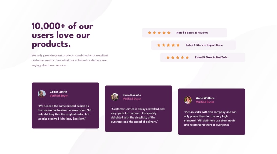
Hi rishat-se, I think you did a great job here! The design looks close to the original, and I love what you did with staggering the cards at around the 800/900px breakpoint (I wish that's something I had thought of)! I guess one suggestion I have is to see whether the star rows can also be at an optimal view at around the 700px mark, because right now I see them stretched out across the screen with a lot of white space surrounding the content. I took some time to experiment with this in my solution, and even if it's as simple as putting a
max-width, that would be enough so that all that huge white space won't be so odd.About your question, I guess it's possible to use padding in some cases. I think that's what I ended up doing for the stars and the text in the desktop view because I couldn't get the result I wanted with flexbox (mainly due to how the stars were shaped, and it made the text look not centered vertically). Still, I'd prefer flexbox over anything!
Marked as helpful2@rishat-sePosted over 2 years agoHi Elaine,
Thank you for your feedback! It was really helpful and it is always a pleasure to receive high marks from expert! You remark about stars at 700px is absolutely right. I updated the code. Layout looks better that way! Yes, sure. Flexbox allows to do responsive layouts much faster.
0

Please log in to post a comment
Log in with GitHubJoin our Discord community
Join thousands of Frontend Mentor community members taking the challenges, sharing resources, helping each other, and chatting about all things front-end!
Join our Discord