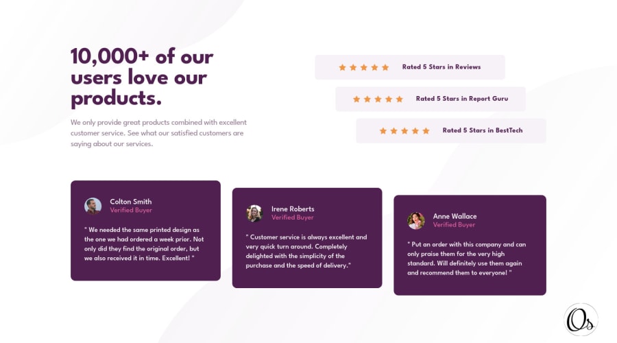
Design comparison
Solution retrospective
second try I hope u like it
Community feedback
- @correlucasPosted about 2 years ago
👾Hello @omarsaleh11, Congratulations on completing this challenge!
Great code and great solution! I’ve few suggestions for you that you can consider adding to your code:
1.Use units as
remoreminstead ofpxto improve your performance by resizing fonts between different screens and devices.To save your time you can code your whole page using
pxand then in the end use a VsCode plugin called px to rem here's the link → https://marketplace.visualstudio.com/items?itemName=sainoba.px-to-rem to do the automatic conversion or use this website https://pixelsconverter.com/px-to-rem2.Don’t use
idto give the style of your elements, it's not a good idea becauseidis a too specific selector used forformsand Javascript code. Instead, useclassfor styling and let theidfor much specific stuff. It's also not advisable to use IDs as CSS selectors because if another element in the page uses the same/similar style, you would have to write the same CSS again. Even if you don't have more than one element with that style right now, it might come later.✌️ I hope this helps you and happy coding!
Marked as helpful0@omarsaleh11Posted about 2 years ago@correlucas thanks as always for the feedback, and of course what you wrote is entirely right and I agree with it,
but I think I never used px in font sizes in my last challenges ( may I be wrong, I don't know) bcoz I use the function of sass to change px to rem.
and I just used id in CSS for once ( remove-events ) I think and I gave it id instead of class bcoz I thought I would never do this name for any other element or tag on the challenge and also to use it in js without making a class.
the main problem in this challenge I think is ( I wrote a lot of CSS media queries ) to make it available in every resolution with different styling
0 - @NIk22517Posted about 2 years ago
Hello @omarsaleh11, Congratulations on completing this challenge!
Nice code and nice solution! You did a good job here putting everything together. Especially like the signature that you have add-in your solution. I’ve some suggestions for you:
You did really good work here putting everything together, something you can improve it's your code you can wrap the paragraph with the quote with the tag <blockquote> this way you'll wrap each block of element with the best tag in this situation.
Marked as helpful0
Please log in to post a comment
Log in with GitHubJoin our Discord community
Join thousands of Frontend Mentor community members taking the challenges, sharing resources, helping each other, and chatting about all things front-end!
Join our Discord
