Submitted about 1 year ago
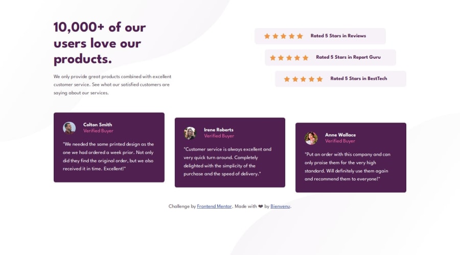
Social proof section using CSS Grid
#accessibility
@bienvenudev
Design comparison
SolutionDesign
Solution retrospective
What specific areas of your project would you like help with?
I'd like your feedback on this:
- I used an absolute height and width of 40px on the testimonial images because I wanted them to maintain a consistent size across all screen sizes.
- I included the first name as the alt text for the testimonial images.
- To style the ratings I added classes like rating1,2 to be able to use transform:translate because when I used nth property it messed up everything.
- Does the heading structure seem meaningful and appropriately organized?
- Is it better to use headings for names on testimonial as suggested in some feedback on this challenge? or styling the names is fine
- I utilized grid for the product testimonials (testimonial cards) and adjusted grid-template columns for larger screens. However, I'm unsure if this is the optimal solution compared to using an intrinsic approach with flexbox and allowing the cards to wrap naturally(ex:tablets).
- I aimed for a smooth transition in the media query from tablet to desktop layouts to avoid abrupt changes but I failed. If there are suggestions for achieving a smoother transition, I'm open to feedback on improving this aspect.
Community feedback
Please log in to post a comment
Log in with GitHubJoin our Discord community
Join thousands of Frontend Mentor community members taking the challenges, sharing resources, helping each other, and chatting about all things front-end!
Join our Discord
