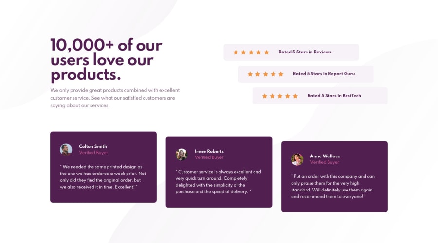
Design comparison
Solution retrospective
👋🏼 Hi everyone,
I had to do some modification because properties like "fit-content" doesn't work properly with the frontend mentor screenshot.
Any recommendation is welcome :)
Enjoy your day and happy coding 👨🏼💻🎉
Community feedback
- @ApplePieGiraffePosted about 4 years ago
Hi, Basile Raiwet! 👋
Good work on this challenge! 👍 Your solution's nearly pixel-perfect for the desktop layout and it responds rather well! 👏
One or two things I'd like to suggest are,
- Making sure there's always a bit of space between the text and the bottom of the card for the testimonial cards (the text comes quite close to the bottom when the width of the screen decreases in the desktop layout).
- Adding a max-width to the testimonial cards and horizontally centering them in the mobile layout so that they aren't too wide when the layout first changes from desktop to mobile.
Keep coding (and happy coding, too)! 😁
1@BasileRaiwetPosted about 4 years ago@ApplePieGiraffe Thanks for your advice :)
About your first recommendation, It behaves like that because I had to set the height in pixel because the "fit-content" property doen't work with the screenshot feature (don't know why since this property is supported by every browser except IE)
Thank you for your comment.
Have a nice day
1@ApplePieGiraffePosted about 4 years ago@BasileRaiwet
NP, Basile! 🙂
Did you perhaps mean
min-content? I believe the screenshots for the design comparison are taken in Firefox and I tried out usingheight: min-contentin your solution in Firefox and it seems to work fine. 👍 I often find that giving an element a variable height dependant on its content (rather than an explicit height) is easier to work with (and it should allow you to keep that space around the content of the card when the height changes).0@BasileRaiwetPosted about 4 years ago@ApplePieGiraffe No, I mean
fit-content😅 I often use this property in the same way you usemin-contentand it work on firefox and chrome but not here . Anyway,min-contentseems to work in the same way in this use-case. 🙂0 - @paiputPosted about 4 years ago
Wow, it's identical to the design. Awesome work!! Congrats!!
0
Please log in to post a comment
Log in with GitHubJoin our Discord community
Join thousands of Frontend Mentor community members taking the challenges, sharing resources, helping each other, and chatting about all things front-end!
Join our Discord
