Submitted about 1 year ago
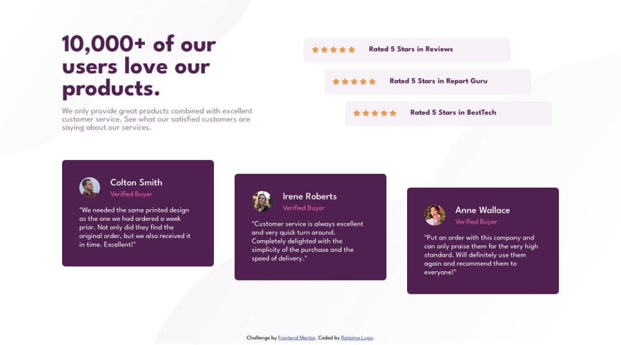
Social proof section usign HTML y CSS
@roraima1986
Design comparison
SolutionDesign
Solution retrospective
I think I made this design the best I could. I had difficulties with the background images, I still have a lot to learn about positions in CSS. If anyone can give me advice on how to position the images in this design, I would appreciate it.
Community feedback
- @petritnurediniPosted 10 months ago
Congratulations on completing the Frontend Mentor challenge! Here are some best practices recommendations for your project:
- HTML Semantics: Great use of semantic HTML elements. Consider using
<article>for the card elements for better semantics. - CSS Structure: Well-organized CSS. To enhance maintainability, consider adding comments to separate sections.
- Responsive Design: Ensure that the design is fully responsive on various screen sizes. Test the layout on different devices.
- Image Optimization: Optimize images for faster loading times, especially for background images.
- Accessibility: Ensure all images have descriptive
alttags and consider adding ARIA attributes where necessary.
Keep exploring and refining your skills. Here are some resources for further learning:
- HTML Semantic Elements
- CSS Best Practices
- Responsive Web Design
- Image Optimization
- Web Accessibility Guidelines
Keep up the excellent work, and happy coding! 🚀
Marked as helpful0 - HTML Semantics: Great use of semantic HTML elements. Consider using
Please log in to post a comment
Log in with GitHubJoin our Discord community
Join thousands of Frontend Mentor community members taking the challenges, sharing resources, helping each other, and chatting about all things front-end!
Join our Discord
