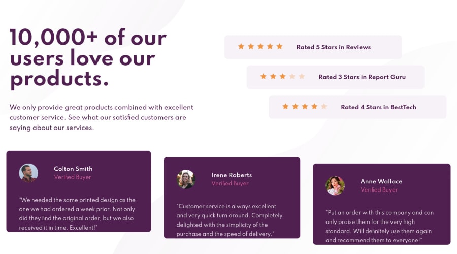
Design comparison
SolutionDesign
Solution retrospective
My Third Challenge Here.
I tried to work with Flex in this challenge. Right now I'm not sure if I used it enough well.
Maybe someone can look at the source code and let me know how to improve Flex in this Project?
I tried my best with Flex to be Responsive. So I made an extra @media section to transform for smaller Viewports. I copy there almost all SCSS from other files to make changes to Mobile Phones. But I think this is not exactly how I should manage it.
Maybe someone has a better idea of how to manage SCSS files and use @media for Responsive?
Community feedback
Please log in to post a comment
Log in with GitHubJoin our Discord community
Join thousands of Frontend Mentor community members taking the challenges, sharing resources, helping each other, and chatting about all things front-end!
Join our Discord
