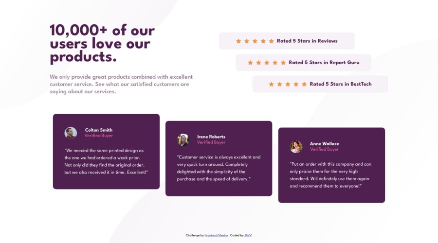
Social Proof Section [Responsive Component - Grid Layout and Flexbox]


Design comparison

Solution retrospective
Hello! 👋
This is my solution to the Social Proof Section Challenge.
First, reviewing the code of my solution to other challenges. What I saw was my naming convention was too long or too hard to read. So I changed my approach in using the naming convention but descriptive enough to know what part of section is being manipulated.
For the layout, I used the Grid Layout, this is also used to center the component and it also sticks the footer to the bottom.
body {
display: grid;
grid-template-rows: 1fr 50px;
justify-content: center;
align-items: center;
min-height: 100vh;
}
To achieve the responsiveness of the font to the different screen I change my approach in font-sizes, applying the 'Fluid Typography' . CSS-Tricks and Trent Walton is what helped me apply the Fluid Typography technique.
To achieve the responsiveness of the font to the different screen I used the "Fluid Column Snippet' of the CSS-Tricks - Grid Layout with a bit of modification to the width of column.
grid-template-columns: repeat(auto-fit, minmax(371px, 1fr));
If you have any tips that can improve the solution I'll be happy to hear any advice! 😁
Community feedback
- @0xabdulkhaliqPosted over 1 year ago
Hello there 👋. Congratulations on successfully completing the challenge! 🎉
- I have other recommendations regarding your code that I believe will be of great interest to you.
DECORATIVE SVG'S ♨️:
- The
altattribute is used to provide alternative text for images in HTML documents. Thealtattribute is used by screen readers to describe the image to visually impaired users, which is essential for web accessibility.
- Now, when it comes to decorative
SVGs, they are used purely for aesthetic purposes and do not convey any important information or functionality to the user.
- Since these images do not convey any important information or functionality, there is no need for an
altattribute.
- So feel free to set the
altattribute as""for decorativesvg's, becausealt=""will be skipped by screen readers they will consider the image as decoration
Example:
<img src="images/decorative.svg" alt=""><img src="images/icon-star.svg" alt="Star-icon" class="star"> 👇 <img src="images/icon-star.svg" alt="Star-icon" class="">
.
I hope you find this helpful 😄 Above all, the solution you submitted is great !
Happy coding!
1@daisukeeitaPosted over 1 year ago@0xAbdulKhalid
Hi! 👋
I'll do this. Thanks a lot for the info! 😁
0@0xabdulkhaliqPosted over 1 year ago@daisukeeita Glad you found it helpful ! 🤠
1

Please log in to post a comment
Log in with GitHub
Join our Discord community
Join thousands of Frontend Mentor community members taking the challenges, sharing resources, helping each other, and chatting about all things front-end!
Join our Discord