Design comparison
Solution retrospective
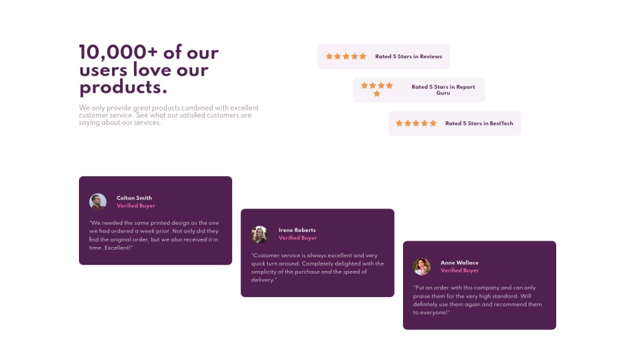
How exactly will you move the cards as shown in desktop preview? Like the way the are not in a straight line. I hope I was clear.
I used grid-template-areas to get it as close as possible, but it still looks a bit off.
Community feedback
- Account deleted
Hi Rohit Regimon ! I think the best/cleaner way to do it would be to use CSS Grid.
You could also use a little margin/padding to make the card go down a bit.
If you need, I could make you a little example when I have time !
1@rrgmonPosted over 3 years ago@Laharls Hey, thank you for reaching out! If it is not too much trouble, I'll take you up on that offer! Only if you have time though :D
0Account deleted@rrgmon It's not a problem! :D Here a link to see quickly the result I've got: https://example-frontend-mentor.vercel.app/
Here's what I have done :
HTML :
<!DOCTYPE html>
<html lang="en">
<head>
    <meta charset="UTF-8">
    <meta http-equiv="X-UA-Compatible" content="IE=edge">
    <meta name="viewport" content="width=device-width, initial-scale=1.0">
    <link rel="stylesheet" href="style.css">
    <title>Document</title>
</head>
<body>
    <div class="container">

            <div class="item number1">
                <span>Colton Smith</span>
                <span class="verified">Verified buyer</span>
                <p class="text">We needed the same printed design as the one we had ordered a week prior. Not only did they find the original order, but we also receive it in time. Excellent!</p>
            </div>

            <div class="item number2">
                <span>Irene Roberts</span>
                <span class="verified">Verified buyer</span>
                <p class="text">Customer service is always excellent and very quick turn around. Completely delighted with the simplicity of the purchase and the speed of delivery.</p>
            </div>

            <div class="item number3">
                <span>Anne Wallace</span>
                <span class="verified">Verified buyer</span>
                <p class="text">Put an order with this company and can only praise them for the very high standard. Will definitively use them again and recommend them to everyone!.</p>
            </div>
    </div>
</body>
</html>
CSS:
.container{
    display: flex;
    justify-content: space-between;
    min-height: 300px;
    color: white;
}

.item{
    text-align: center;
    border-radius: 10px;
    background-color: blueviolet;
    position: relative;
}

.verified{
    display: block;
    margin-bottom: 2rem;
}

.text{
    width: 55%;
    margin: 0 auto;
}

.number1{
    border: 5px solid brown;
    margin-right: 2%;
}

.number2{
    border: 5px solid green;
    margin-right: 2%;
    top:20px;
}

.number3{
    border: 5px solid red;
    top: 50px;
}
For the HTML part, it's very basic, I made a main container, in which I added the 3 cards.
Then, for the CSS part, I choose to make a flexbox (it's similar to CSS Grid) which allowed me to align my three cards very easily. Also, you can see I added a property position: relative in my item class. It's a property that permits you to move an element by its default position. Then, in the selected card you want to move (number1 for the first card, number2 for the second card, and number for the last card), you can use four property to move your elements which are :
- top
- right
- left
- bottom
Here's a link which talks more about the position property: https://www.w3schools.com/css/css_positioning.asp
I hope my explanation was clear, don't hesitate to ask me if something is not clear enough!
0@rrgmonPosted over 3 years ago@Laharls Thanks a ton! That was very clear and detailed. I really appreciate this! :D
I'll go ahead and try to implement the same with my solution. Again, thank you!
0
Please log in to post a comment
Log in with GitHubJoin our Discord community
Join thousands of Frontend Mentor community members taking the challenges, sharing resources, helping each other, and chatting about all things front-end!
Join our Discord
