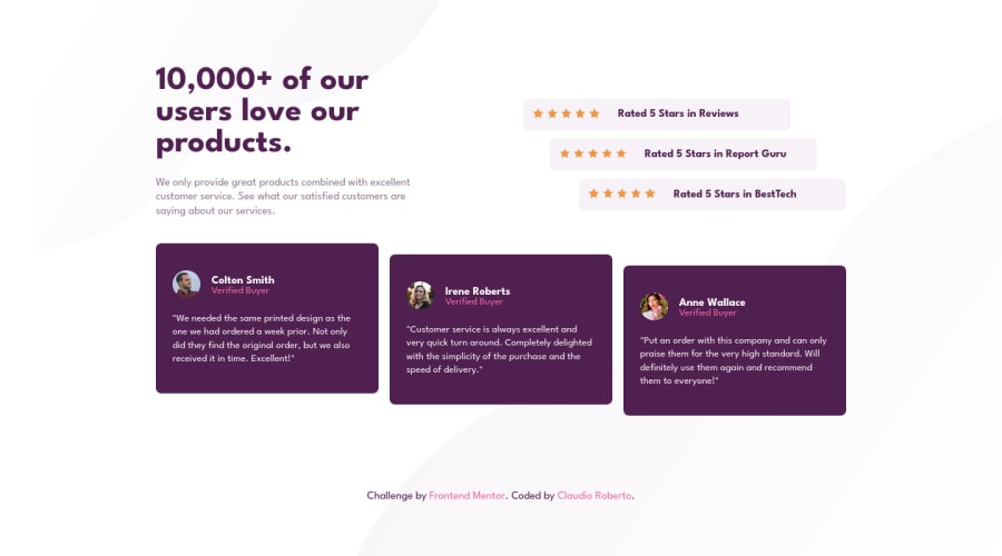
Design comparison
Solution retrospective
I guess media queries could be better for mobile devices but i had some difficulties, you can share your tips and opinion for i improve this solution and correct any mistakes. See my code on github, Thanks!
Community feedback
- @VCaramesPosted almost 2 years ago
Hey there! 👋 Here are some suggestions to help improve your code:
Regarding your question,
Implement a mobile first approach 📱 > 🖥. This will make things easier in ensuring that your content looks the way want it to in any screen size. To achieve this, you start building your website/content for smaller screen first and then adjust your content for larger screens.
- The “star icons” serve no purpose other than to** be decorative;** They add no value. Their
alt tagshould left blank and have anaria-hidden=“true”to hide them from assistive technology.
More Info:📚
https://www.w3schools.com/html/html_images_picture.asp
- To improve the semantics of your component, you want to wrap each individual testimonial component in a
Figureelement, the individuals information should be wrapped in aFigcaptionelement and lastly, the testimonial itself should be wrapped in aBlockquoteelement.
Code:
<figure>
   <figcaption></figcaption>
   <blockquote></blockquote>
</figure>
More Info:
If you have any questions or need further clarification, feel free to reach out to me.
Happy Coding!🎄🎁
Marked as helpful1@claudio-dev1993Posted almost 2 years ago@vcarames Thank you for the tips! I'm learning about the mobile first approach, so I don't know how to implement it properly yet. I'll review the code and apply the other tips you recommended so thanks again!
1 - The “star icons” serve no purpose other than to** be decorative;** They add no value. Their
Please log in to post a comment
Log in with GitHubJoin our Discord community
Join thousands of Frontend Mentor community members taking the challenges, sharing resources, helping each other, and chatting about all things front-end!
Join our Discord
