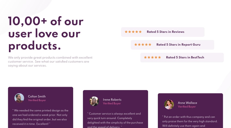


Design comparison
SolutionDesign

Solution retrospective
Any feedback is welcome :)
Community feedback
- @vanzasetiaPosted over 3 years ago
👋 Hi Thais!
I have some feedbacks on this solution:
- Accessibility
- For any decorative images, each
imgtag should have emptyalt=""andaria-hidden="true"attributes to make all web assistive technology such as screen readers or screen magnifiers ignore those images. In this case all images are decorative only except the photo images. - For the photo images, I would recommend to use their name as the alternative text.
- Headings should be chronological order. You should use
h1,h2,h3untilh6in a logical order. Logical heading order will make all users that use assistive technologies such as screen reader can navigate the website easily. - Use
remor sometimesemunit instead ofpx. Usingpxwill not allow the users to control the size of the page based on their needs.
- For any decorative images, each
- Non Accessibility
- The design width size should not be your breakpoint for your media query most of the time. In this case on screen that has width less than
375pxwill see desktop layout, since you're forcing thebodyelement to have1440px. - Setting
bodyelement to have minimum900pxheight is not good for responsiveness. - I would recommend to write your stylesheet with mobile first approach, which means your base styling (CSS code outside the media query scope) should be for styling mobile layout and then after that you can use
@media (min-width: <size>)to style bigger screen size. - Don't forget to see your website on mobile landscape mode.
- I notice an
idselector on your stylesheet (#stars-box). I would recommend to change it to class to prevent high specificity unnecessarily in your stylesheet.
- The design width size should not be your breakpoint for your media query most of the time. In this case on screen that has width less than
- Question
- Why do you wrap every photo
imgtag withfiguretag? Could you explain that to me?
- Why do you wrap every photo
That's it! Hopefully this is helpful!
Marked as helpful2@thaiscodePosted over 3 years ago@vanzasetia Your feedback was very helpful! I sent another solution with your recommendations, could you take a look?
https://www.frontendmentor.io/solutions/social-proof-section-solution-using-mobile-first-A6awZWuu-
0@vanzasetiaPosted over 3 years ago@thaiscode Yes, I have taken a look at your solution and dropped feedback there.
0 - Accessibility

Please log in to post a comment
Log in with GitHub
Join our Discord community
Join thousands of Frontend Mentor community members taking the challenges, sharing resources, helping each other, and chatting about all things front-end!
Join our Discord