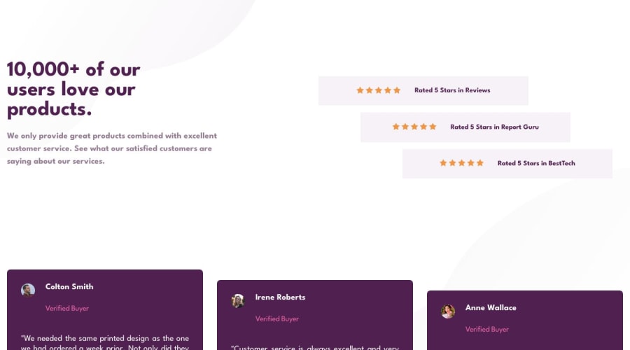
Social proof section master using display grid and flex
Design comparison
Solution retrospective
Hello team ,
Please take the time to review my code section for the solution for this challenge
Community feedback
- @Zy8712Posted about 1 year ago
Your solution looks pretty solid. The main things I'd say you should modify is the spacing of items from the edge of the screen and the spacing of the "Verified Buyer" title. I feel like keeping the main contents of your page closer to the center of your screen is pretty important as it makes it easier for users to read things straight away and not have to scan the whole page left to right for the information.
Aside from that your solution is pretty solid. Nice work 👍
Marked as helpful0 - @MelvinAguilarPosted about 1 year ago
Hello there 👋. Good job on completing the challenge !
I have some suggestions about your code that might interest you.
- For star icons used decoratively, like in this challenge, it's best to keep the alt attribute empty. This prevents screen readers from repetitively reading the same description, which can be bothersome for users with visual impairments. So, you can simplify the code by leaving the alt attributes for the star icons empty.
- You should use a descriptive alt attribute for testimonial images. Instead of using "profile.pic" as the alt text, use the person's name or a brief description. This enhances accessibility for users with screen readers and search engines, making your content more inclusive and SEO-friendly.
I hope you find it useful! 😄
Happy coding!
Marked as helpful0
Please log in to post a comment
Log in with GitHubJoin our Discord community
Join thousands of Frontend Mentor community members taking the challenges, sharing resources, helping each other, and chatting about all things front-end!
Join our Discord
