Submitted about 1 year ago
Social proof section master solution by [Naimur]

@NaimurRahman00

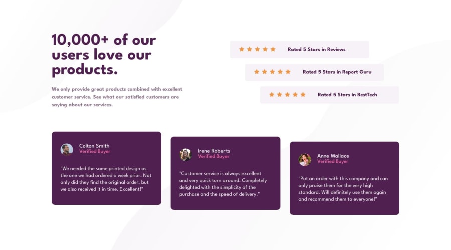
Design comparison
SolutionDesign

Solution retrospective
Hi! I’m Naimur and this is my Social proof section master solution.
- How was my solution?
- How was the Animation and Hover effect?
- Can I get some suggetion for Responsive part?
Thank you.
Community feedback
Please log in to post a comment
Log in with GitHub
Join our Discord community
Join thousands of Frontend Mentor community members taking the challenges, sharing resources, helping each other, and chatting about all things front-end!
Join our Discord