Design comparison
Solution retrospective
Any feedback is valuable and thank u.
Community feedback
- @correlucasPosted over 2 years ago
👾Hi @imendh02, congrats on completing this challenge!
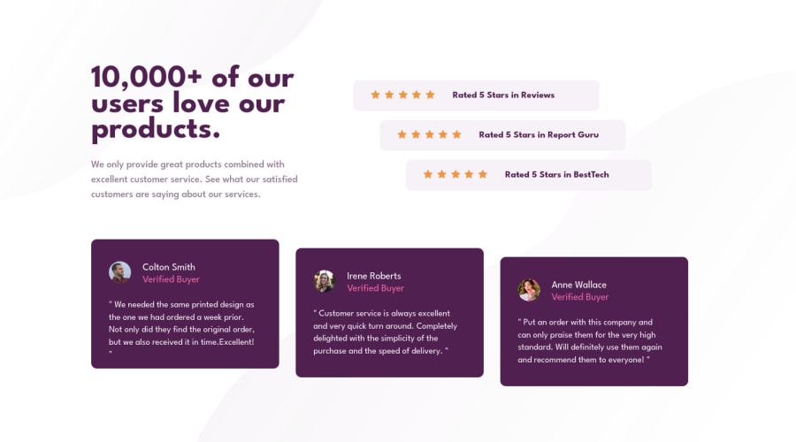
Amazing solution! I’ve just opened the solution’s live site and I liked the job you’ve done a lot. I’ve some suggestions for you:
You did a really good work here putting everything together, something you can improve its your code html markup and semantics. You can replace the
<div>that wraps each card with<article>you can wrap the paragraph with the quote with the tag<blockquote>this way you'll wrap each block of element with the best tag in this situation. Pay attention that<div>is only a block element without meaning.Here's a complete guide for HTML semantic TAGS: https://www.w3schools.com/TAgs/default.asp✌️ I hope this helps you and happy coding!
Marked as helpful1 - @OhSorrowPosted over 2 years ago
Hey dear Imen! Congratulations for completing this challenge! 👏
As far as I can see, the
feedbackflex items are not centered on desktop layout. You can fix it by adding the following piece of code:.feedback { justify-content: center; }Note: Instead of using
margin-left, usegapproperty for flex-items.Happy coding :)
Marked as helpful1
Please log in to post a comment
Log in with GitHubJoin our Discord community
Join thousands of Frontend Mentor community members taking the challenges, sharing resources, helping each other, and chatting about all things front-end!
Join our Discord
