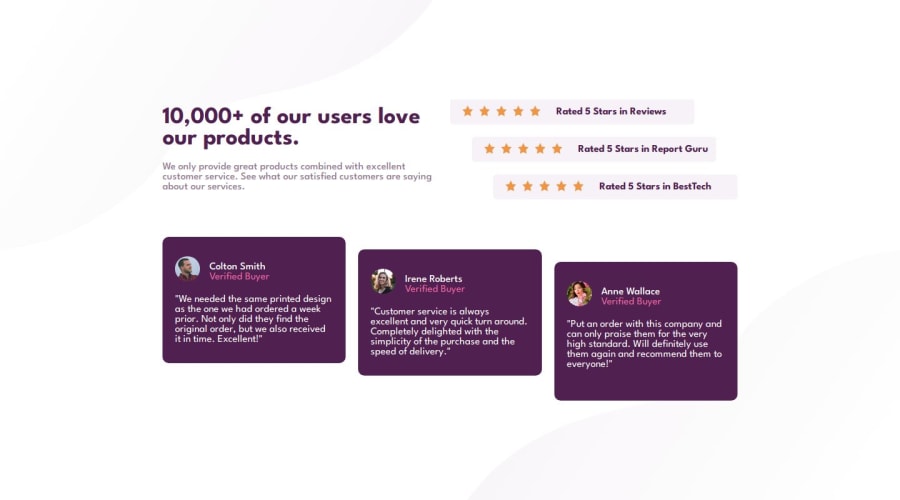
Design comparison
SolutionDesign
Solution retrospective
Hi, I'm Sakti, This is my solution in this challenge.
In this challenge I had difficulty creating an unusual list card layout to make it different in position and also make it look good when the card list had more than 3 items.
Community feedback
- @darley-santosPosted 10 months ago
You did well; you could reduce the width of the first two texts to make it look more like the design.
0@saktiajadehPosted 10 months agoHi @darley-santos, I am happy to your suggestion for better results. Thanks for the feedback.
0
Please log in to post a comment
Log in with GitHubJoin our Discord community
Join thousands of Frontend Mentor community members taking the challenges, sharing resources, helping each other, and chatting about all things front-end!
Join our Discord
