Submitted 11 months ago
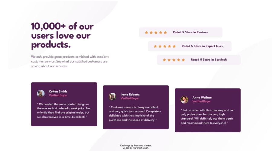
Social proof section in HTML, CSS and JavaScript
@harpreet-singh-147
Design comparison
SolutionDesign
Solution retrospective
Merry Christmas! I had a problem with this project when changing the layout from flexbox to making an element static (the footer) - @media only screen and (max-width: 1120px). Then changing the direction to flex-direction column. My main element was always staying the same size, and the content was always overflowing it . I had to set the main element to overflow: auto to fix this issue, but this is not the right way, as it should be dynamic when the viewport size is decreased. Can somebody look at this and give some feedback please? Thanks!
Community feedback
Please log in to post a comment
Log in with GitHubJoin our Discord community
Join thousands of Frontend Mentor community members taking the challenges, sharing resources, helping each other, and chatting about all things front-end!
Join our Discord
