Submitted about 3 years ago
Social proof section - HTML, CSS, & Vite
#bem#sass/scss
P
@DarrickFauvel
Design comparison
SolutionDesign
Solution retrospective
Hi everybody, 👋
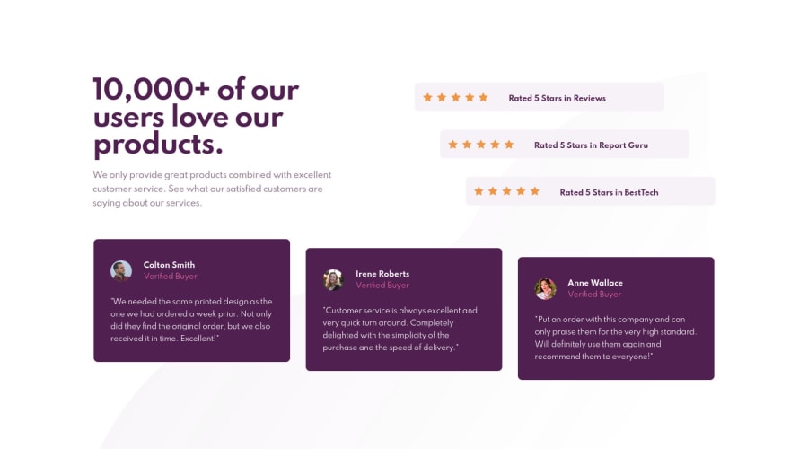
I'm wondering if there is a better way to position the bottom background image. Currently mine appears to be clipping when the page is scrolled. 🤷♂️ I'd really appreciate any insight on this.
Please let me let me know if I missed anything or I could do something better.
Thanks! 😊
Community feedback
Please log in to post a comment
Log in with GitHubJoin our Discord community
Join thousands of Frontend Mentor community members taking the challenges, sharing resources, helping each other, and chatting about all things front-end!
Join our Discord
