Submitted over 1 year ago
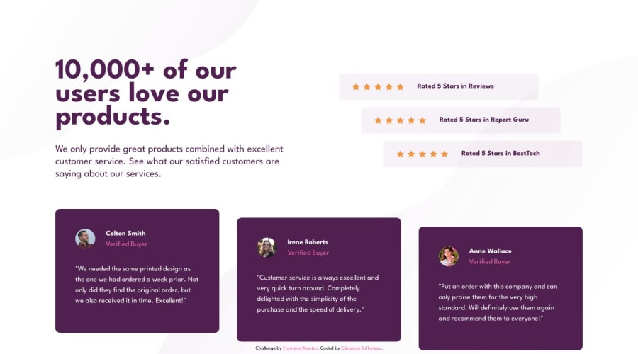
Social proof section - HTML and CSS

@ClemenceTafforeau

Design comparison
SolutionDesign

Solution retrospective
As always, I encountered many difficulties trying to make the page responsive. What are the best practises regarding media queries ? Is it better to place them under the class they're attached to or put everything in one big media query ?
Community feedback
Please log in to post a comment
Log in with GitHub
Join our Discord community
Join thousands of Frontend Mentor community members taking the challenges, sharing resources, helping each other, and chatting about all things front-end!
Join our Discord