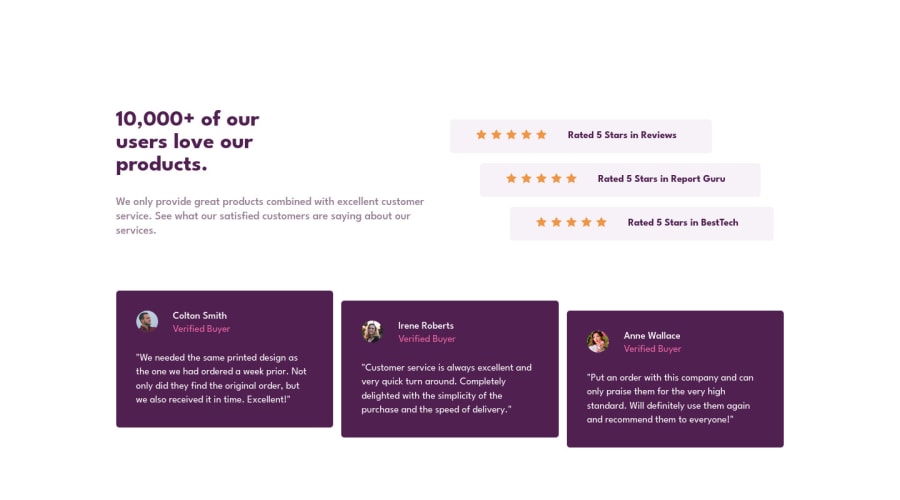
Design comparison
Solution retrospective
In this project the hardest part for me was to create the cards and put the correct space between them, but I found the solution with a few tests.
To see the correct desktop view your screen must be (1440px)
Community feedback
- @vanzasetiaPosted over 2 years ago
Hi, Lucas!
"To see the correct desktop view your screen must be (1440px)", that is not the way responsive design works. You want to switch to the desktop layout when there is enough space for that. That does not have to be
1440px.Add a media query whenever the content starts to break or have enough space to change the layout.
Learn more — Responsive design ground rules (updated for 2021) | Polypane, The browser for ambitious developers
Some more suggestions:
- The star icons are decorative images.
- Not every image needs alternative text. Decorative images should not have alternative text (
alt=""). This will tell the screen reader to skip over the image. As a result, it saves screen reader users time navigating the page. - For your information, decorative images are images that don't add any information and serve only aesthetic purposes.
- Alternative text for images should not include any words that are related to the word "image". The semantic meaning of the
<img>element tells assistive technologies to pronounce it as an image. - The alternative text for the avatars should be their name. For example, the
image-colton.jpgshould have "Colton Smith" as the alternative text (alt="Colton Smith"). - Add
rel="noopener"to all links withtarget="_blank". It helps protect users of legacy browsers from security issues. Read more — Links to cross-origin destinations are unsafe
I hope this helps. Happy coding!
Marked as helpful0@lucasbailoPosted over 2 years ago@vanzasetia Thanks for the feedback!
I didn't know about the relation of alt and screen readers, and about decorative images!
About the noopener, it was new for me too. Your tips were really helpful, I'm really happy to see that there are people who want to help me in my journey!
0@vanzasetiaPosted over 2 years ago@lucasbailo No problem! I am glad I could help. 😄
0 - @lucasbailoPosted over 2 years ago
Comparing side to side the projects I saw that I need to correct the size of the fonts and put the image background. I'll do it later but for now, it's ok!
0
Please log in to post a comment
Log in with GitHubJoin our Discord community
Join thousands of Frontend Mentor community members taking the challenges, sharing resources, helping each other, and chatting about all things front-end!
Join our Discord
