Design comparison
SolutionDesign
Community feedback
- @correlucasPosted over 2 years ago
👾Hello Chills, congratulations for your solution!
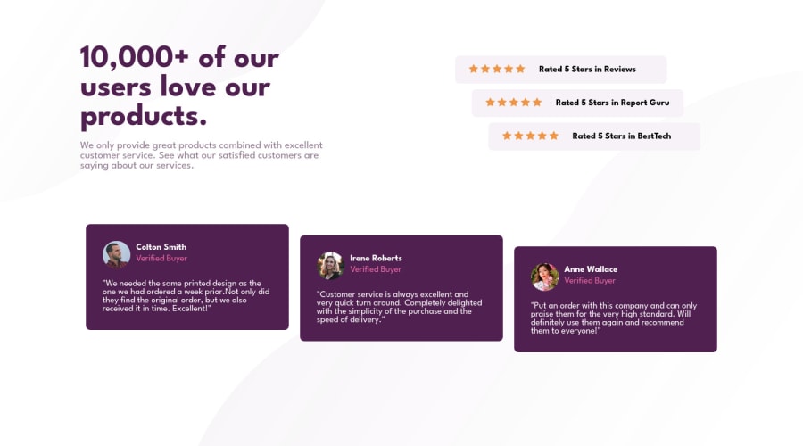
Your solution design is really, you're almost there. But you need to give the cards more padding to let it grow a little (note that is a little bit different from the design files). And you've missed also the background alignment and size, to fit the
background-imagefullheightyou need to replace it in the body and not in the container, see the code fixes below:body { min-height: 100vh; background-image: url(images/bg-pattern-top-desktop.svg), url(images/bg-pattern-bottom-desktop.svg); background-position: top left, bottom right; background-repeat: no-repeat; background-size: contain; }See if works for you!
Marked as helpful0
Please log in to post a comment
Log in with GitHubJoin our Discord community
Join thousands of Frontend Mentor community members taking the challenges, sharing resources, helping each other, and chatting about all things front-end!
Join our Discord
