Design comparison
Solution retrospective
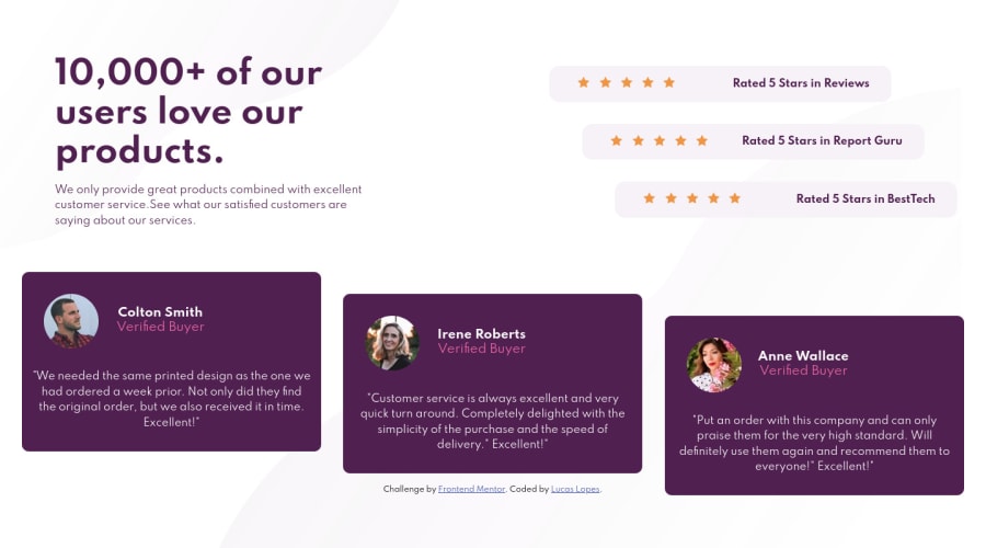
Hi everyone, just finished my second challenge. I built it using CSS Flexbox. kindly go through and give me a feedback, specially in media queries. Thanks =]
Community feedback
- @brenodtPosted about 4 years ago
Hey man 👋 I'm not a pro, but one quick suggestion I have is that making the rating cards and user cards relative in size could help on the desktop layout. There's a size before your media query here they get distorted and a bit hidden. Another solution could be to have a mid-way query like
@media (max-width: 1000px). One other small adjustment I'd do is the text alignment on the mobile version. Having it centered would make it look more appealing. You're already using flexbox, so it just be easy to adjust. Great work! Cheers.1@luccaslopes88Posted about 4 years ago@brenodt thanks so much for the feedback, for sure i will try your suggestion now. Thanks again :D
1
Please log in to post a comment
Log in with GitHubJoin our Discord community
Join thousands of Frontend Mentor community members taking the challenges, sharing resources, helping each other, and chatting about all things front-end!
Join our Discord
