Design comparison
Community feedback
- @VCaramesPosted almost 2 years ago
Hey there! 👋 Here are some suggestions to help improve your code:
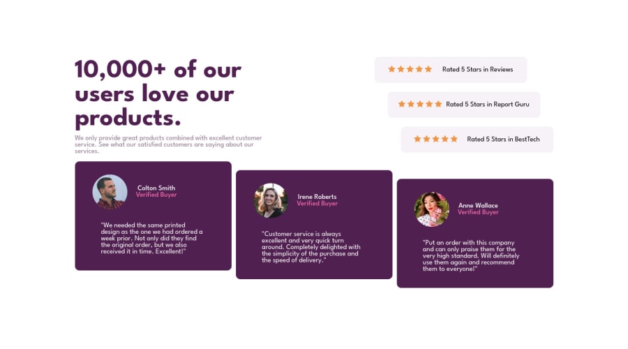
- The profile images are not decorative. Their
alt tagshould not be blank. It should state the following; “Person’s full name-“
More Info:📚
- For the testimonials, it is best ✅ to to wrap each individual testimonial component in a
figureelement, the individuals information should be wrapped in afigcaptionelement and lastly, the testimonial itself should be wrapped in ablockquoteelement.
Code:
<figure>
   <blockquote></blockquote>
   <figcaption></figcaption>
</figure>
More Info:📚
- Your
CSS Resetis being underutilized. 😢 To fully maximize 💯 it, you will want to add more to it. Here are some examples that you can freely use 😁: Josh Comeau Reset Eric Meyer Reset
- Implement a "Mobile First" approach 📱 > 🖥
Mobile devices are now the dominant 👑 way in which people browse the web, it is critical that your website/content looks perfect 💯 on all mobile devices.
More Info: 📚
- For improved accessibility 📈 for your content, it is best practice ✅ to use
emformedia-queries. Using this unit gives users the ability to scale elements up and down, relative to a set value.
If you have any questions or need further clarification, feel free to reach out to me.
Happy Coding! 🎆🎊🪅
Marked as helpful1@matthew-marcoPosted almost 2 years ago@vcarames but why should I use figure and blockquote it is the first time I hear about them and idk what they use for also the css reset is like the normalize right and next time I will use em and write more media-queries thx
0@VCaramesPosted almost 2 years ago@matthew-marco
- Semantics; giving your code structure and meaning
- Correct
- ✅
0 - The profile images are not decorative. Their
Please log in to post a comment
Log in with GitHubJoin our Discord community
Join thousands of Frontend Mentor community members taking the challenges, sharing resources, helping each other, and chatting about all things front-end!
Join our Discord
