Design comparison
Solution retrospective
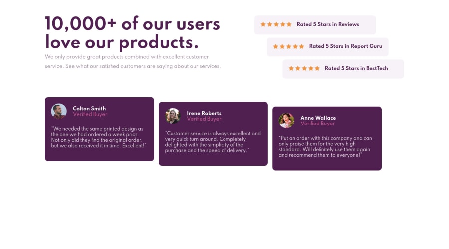
This is my solution to the Social proof section challenge on Front end Mentor.
Community feedback
- @shashreesamuelPosted about 3 years ago
Hey good job completing this challenge
Keep up the good work
Your solution looks great however I think your content just needs a bit of margin from the top using
margin-top.In terms of your accessibility issues simply wrap all your content between
maintags.I hope this helps
Cheers Happy coding 👍
Marked as helpful0@safXcodePosted about 3 years ago@TheCoderGuru thank you for looking at my code.. i ll fix this as soon as possible
0
Please log in to post a comment
Log in with GitHubJoin our Discord community
Join thousands of Frontend Mentor community members taking the challenges, sharing resources, helping each other, and chatting about all things front-end!
Join our Discord
